When it comes to choosing the right packaging material for your product, you can’t go wrong by paying close attention to the details. After all, packaging may just be one of the biggest factors in making your product a success.
The right packaging not only attracts consumers, it will keep your product safe in transportation and keep it fresh. This reinforces the quality of the brand and item when customers know they can count on a fresh item from when it hits the shelf to when it’s in their hand.
For this example, we’ll focus on a notorious packaging redesign of Tropicana’s fruit juice. On January 9th 2009, the PepsiCo-owned brand decided to replace the existing packaging design for its best-selling orange juice with new packaging for the North American market.
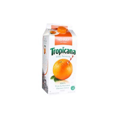
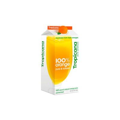
However, the team did not successfully predict the outcome of the new fresh design they rolled out. It was a total failure! Such a big failure that Tropicana had to drop it and go back to the original version of the packaging.
In terms of business, sales dropped around 20% (estimated about 30 million dollars), 35 million dollars were invested in marketing and branding, and competitors earned popularity. A colossal disaster with more than 65 million dollars in direct losses and much more indirect damages on account of some consumers switching to alternatives.
Why?
The deep reasons behind Tropicana’s failure stem into human psychology. Customers are strongly connected to the brand consciously, or even subconsciously. Therefore, brand awareness is a significant aspect of product success and conversions. In simple words, the customers have to be able to locate your branding assets at a glimpse.
MIT neuroscientists proved that the brain can identify images seen for as little as 13 milliseconds. This greatly illustrates the importance of increasing the visibility of your brand!
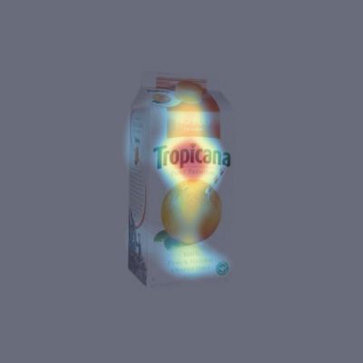
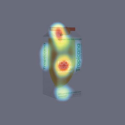
By analyzing the attention maps of the two (old and new) packages, it’s pretty obvious why Tropicana failed so hard. For the new design, the main focal points are the large heading “100% orange” and the futuristic bottle cap. The new Tropicana logo comes third.
On the other hand, the old package has the perfect visual hierarchy and pinpoint the consumer’s attention to the right element. The Tropicana brand grabs the most attention and can’t be unseen.
The customer devotes few seconds (if not milliseconds) of her/his valuable attention span for the attempt to locate the Tropicana orange juice or your own product. If the package design is not good enough, the customer won’t have the patience to locate your brand within the thousand of other option.
VisualEyes offers you a way to accurately simulate the customer’s behavior and test your product’s packaging in seconds.
👇 The VisualEyes’ example project 👇 (or open in a new tab)
