A hero image takes the majority of the space on the most seen page of your entire site, the homepage. This is prime real estate in the digital world and means hero images can be a very valuable asset to your business if used correctly.
In this example, we’re going to look at the importance of hero images and introduce you to how to use VisualEyes to help you choose which featured image will engage your audience more.
The Amos brand (which is no more operating online), was an online eCommerce store that used to shooting its own hero image photographs. This is a great technique to create personalized experiences for your visitor and promote your own products.
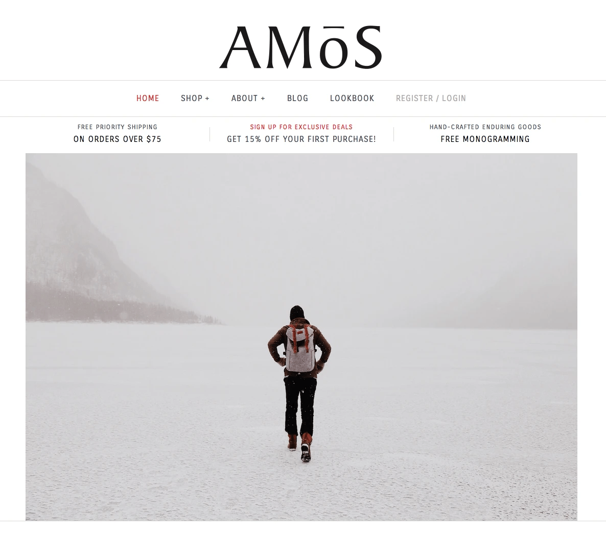
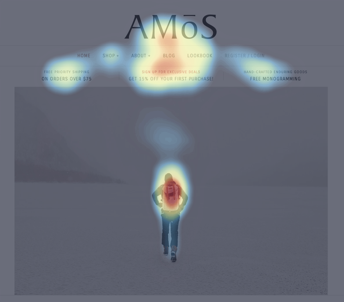
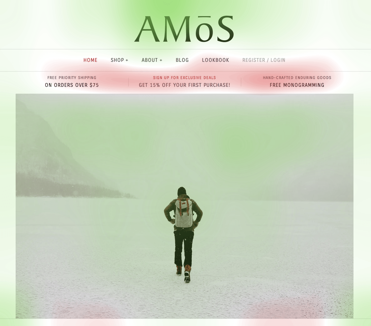
By checking the VisualEyes’ Attention Map of the Amos’ homepage, we notice that the visual hierarchy is symmetrically distributed to the most significant elements of the page. The Amos branding and the main “Sign Up For Exclusive Deals” call to action capture the majority of the user’s attention. The rest of the attention is allocated to the cover image and is somehow separated from the other main focal point. Moreover, the VisualEyes’ Clarity score is 79 which can be considered high.
Can we optimize the Amos’ landing page further, though?!
The answer is yes, and by utilizing predictive insights it can be done in minutes.
The goal is to boost the attention of the two critical elements of the website (Amos Brand and CTA button) and make the user interfaces more clear and aesthetically pleasing (increase Clarity score).
One great method is to test multiple hero images and review the results in attention and clarity. For quick results, I carefully have chosen and placed three stock images from Unsplash that depict a backpack. Of course, you can test your own photographs as well.
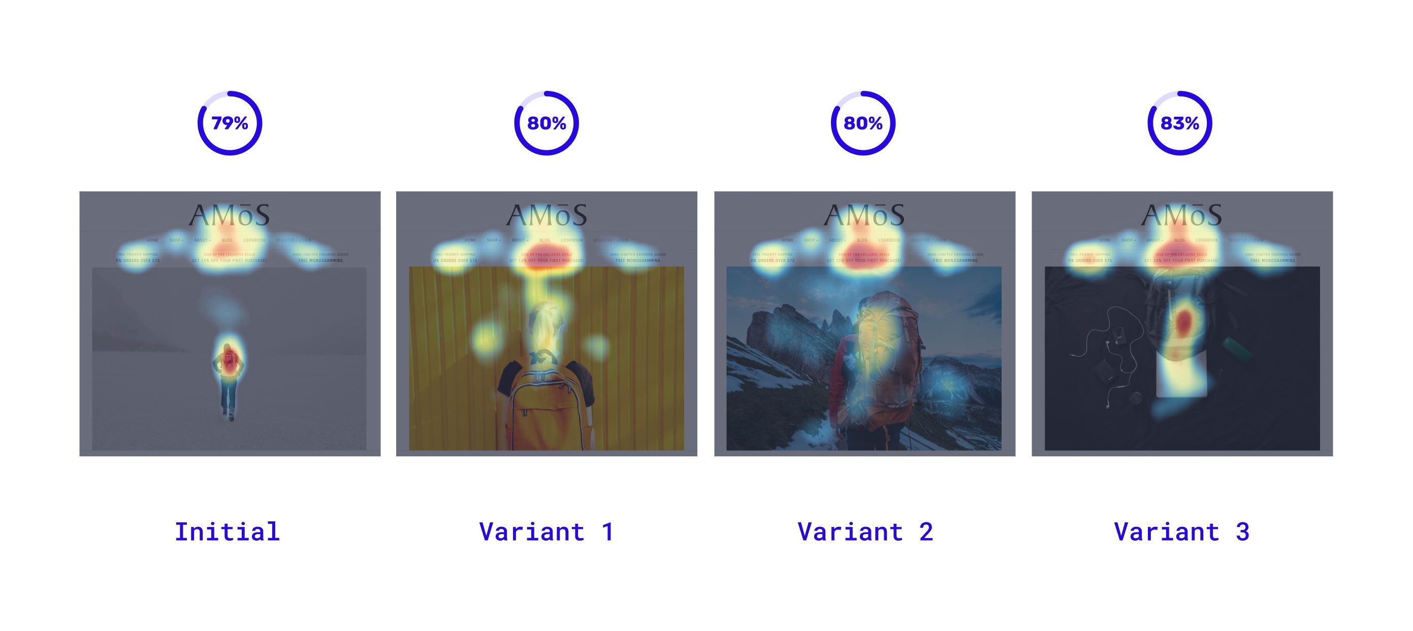
As you can see, the new images changed a little the attention dynamic. The attention moved up and the two focal clusters seem to be less isolated. The top iteration was Variant 3, where the attention-grabbing point of the hero image was placed next to the main Call to action. In that way, our design managed to guide the user’s attention right into the desired direction.
In parallel, by reducing the user’s attention span the total clarity of our design was increased. It’s an logical outcome since less focal points decrease the user’s congitive effort.
The difference of the Clarity scores, between the Initial Variant and the Variant 3, is not huge, but it can have a massive effect in terms of conversions. Several User Experience studies and Hicks’s law indicate that by eliminating cognitive and physical effort it’s easier for your users to convert.
This is a quick way to utilize VisualEyes’ rich insights and grow your conversions up. It takes only a few minutes!
Start testing you own images in VisualEyes platform now! 🎉
👇 The VisualEyes’ example project 👇 (or open in a new tab)
