In this article, we will try to interpret a few Clarity Scores and Clarity Maps and understand the insights we can extract to iterate and design better.
You can download the design files, including some of the following examples to try them yourself and get familiar with VisualEyes.
- Sketch File
- Figma File Soon
- Adobe XD File Soon
Let’s start testing 🎉
First Example
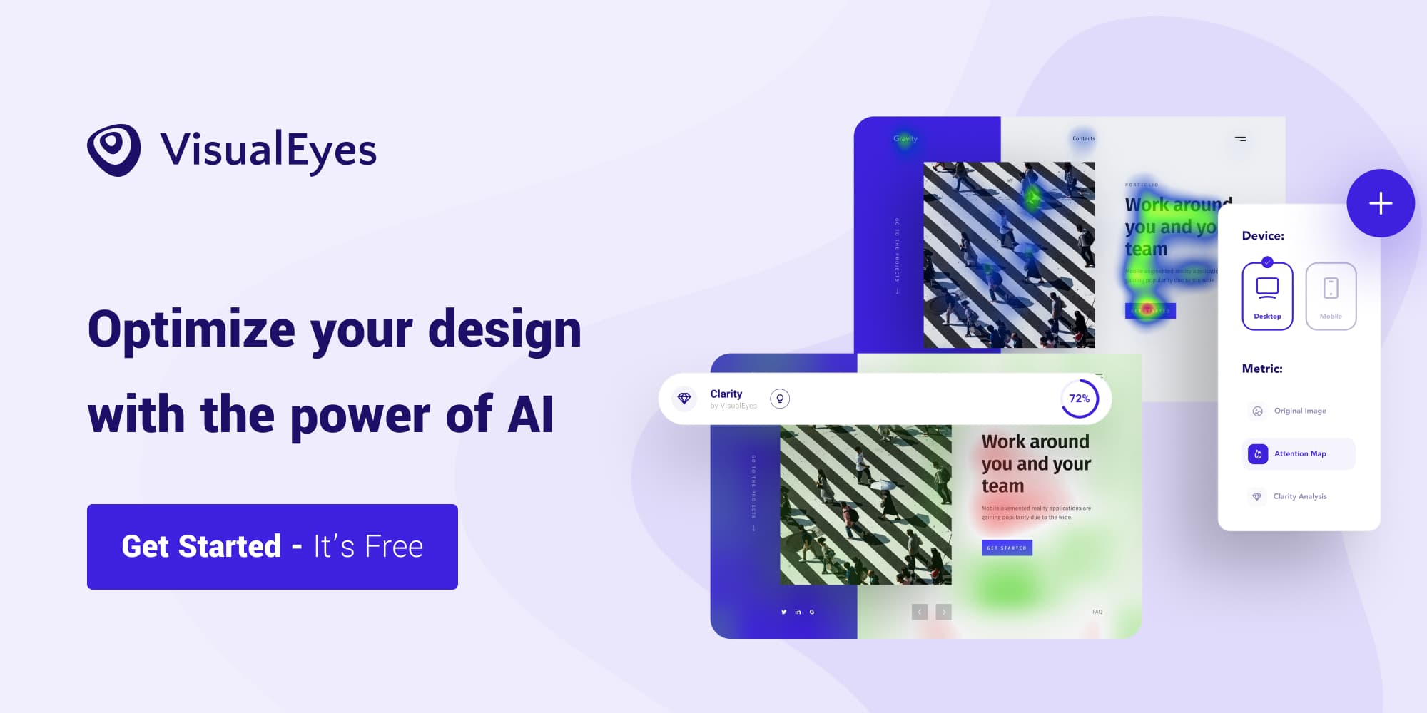
Below we can see an example of Uber’s old and new website. The two sites have a Clarity score of 68 and 77. A higher score means that your design is cleaner and aesthetically more pleasant as our studies have shown.

Let’s break down the scoring badge. The score is expressing as mentioned above, how clean and aesthetically pleasant your design is perceived by users. The desktop icon means that your design was evaluated with our desktop designing algorithms. If the icon is a mobile device, then we evaluated your design with our mobile/tablet algorithms.
The gradient map placed below the blue box is helping you understand how to interpret the results of the Clarity Maps.

Areas highlighted in red therefore are contributing to clutter, whereas areas highlighted in green are having a positive contribution to the clarity score.
💡 If you want to improve clarity score on a specific design, this map will help you pinpoint which pixels could be removed or modified to generate some quick wins.
Second Example
Now let’s get our hands dirty and iterate on a design to make it more clean and pleasant for our users.
Let’s try testing a dashboard design from Pierluigi Giglio.
We can see that it’s Clarity Score is equal to 62, a high score for a dashboard with so much information. Let’s try to fix the red areas of our design to achieve an even higher score.

By removing the Remove text next to the red circular button, we managed to raise by 1 point our score.


If we do not want to sacrifice the usability of our page, we could implement a tooltip in that button.
Now we can continue to test and try to fix the most significant red area that is lowering down our score! I leave it up to you.
Third Example
We will test now a landing page template from a fellow designer, Sebastian Mantel. Below you can see the original Landing page of the template, with a predicted Clarity Score of 81.

We can see clearly that the subtitle, below the Lorem Ipsum headline, is red enough to warn us and take action. Also the Lorem Ipsum subtitles below the stats are lowering down the score because the map is transparent that tends to be red. My effort will be to make the texts a little bit bolder and whiter to increase the contrast with the background.

Now the score increased from 81 to a jaw-dropping 87 🎉 Just by modifying the contrast and the weights of the subtitles.

💡 We cannot eliminate every red area of our designs when we have to deliver some insights to our users and convey a message to them. You need to find a fine line between the score you want to achieve and the context you include in your designs.