For many websites, especially e-commerce and landing pages, call to action elements are a key to sales, traffic, and success.
The call to action is a key element on a webpage, acting as a signpost that lets the user know what to do next. Without a clear CTA, the user may not know the next steps to take to purchase a product or sign up for a newsletter and is likely to leave the site without accomplishing their task.
In the following example, we used two variants of the new and old landing page of Uber for drivers. The team of Uber did a structural re-design that boosted their lead generation process and helped the communication of their brand.
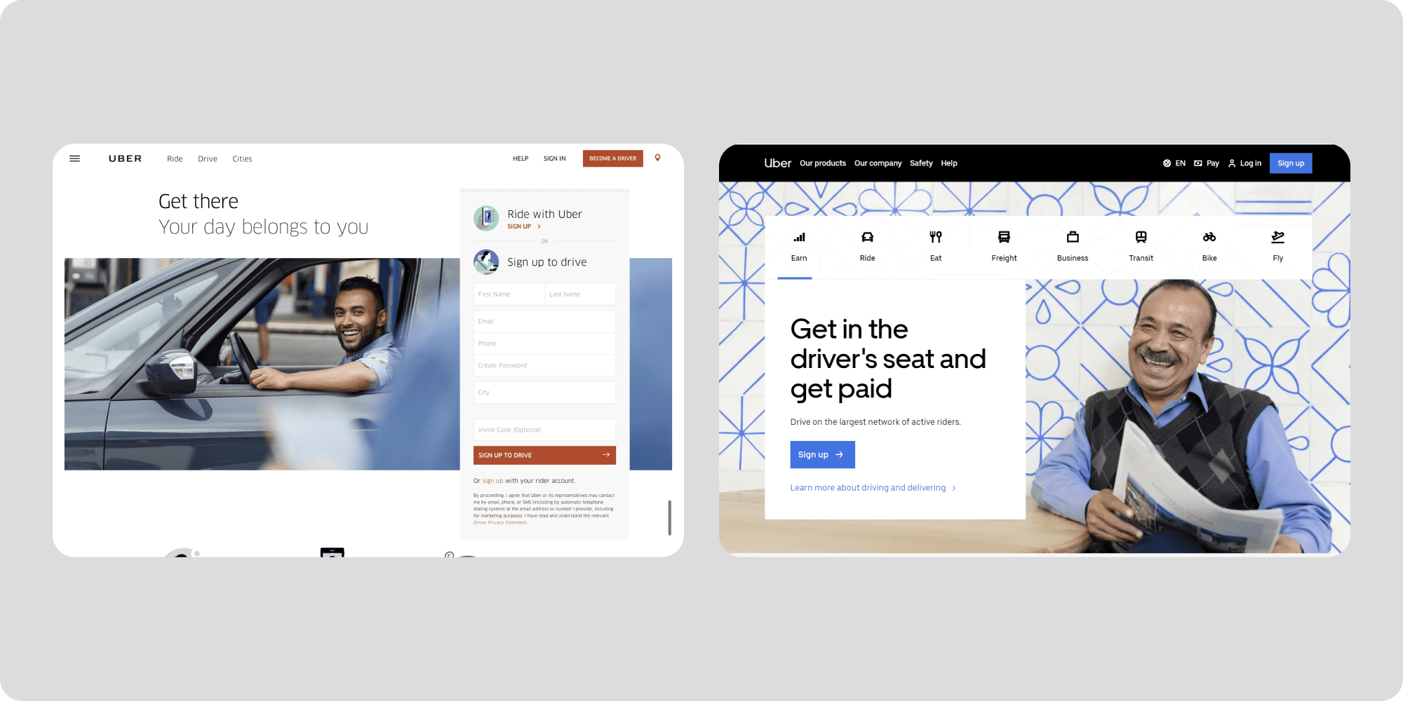
The first step in our design analysis is to create two different predictions for the two landing pages. Below you can have a look at the generated Attention Maps and Areas of Interest (AOI) in the example Prediction pages.
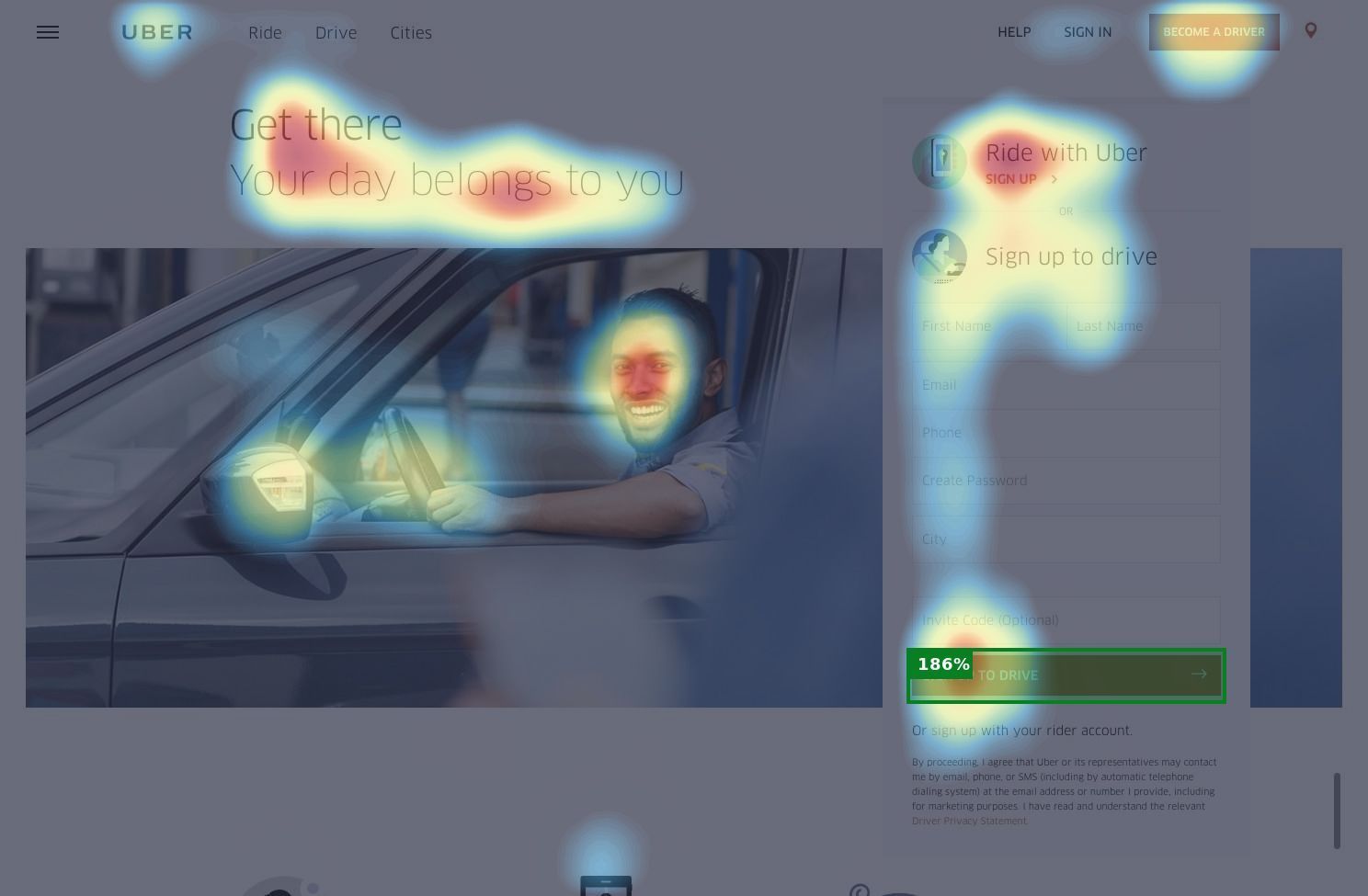
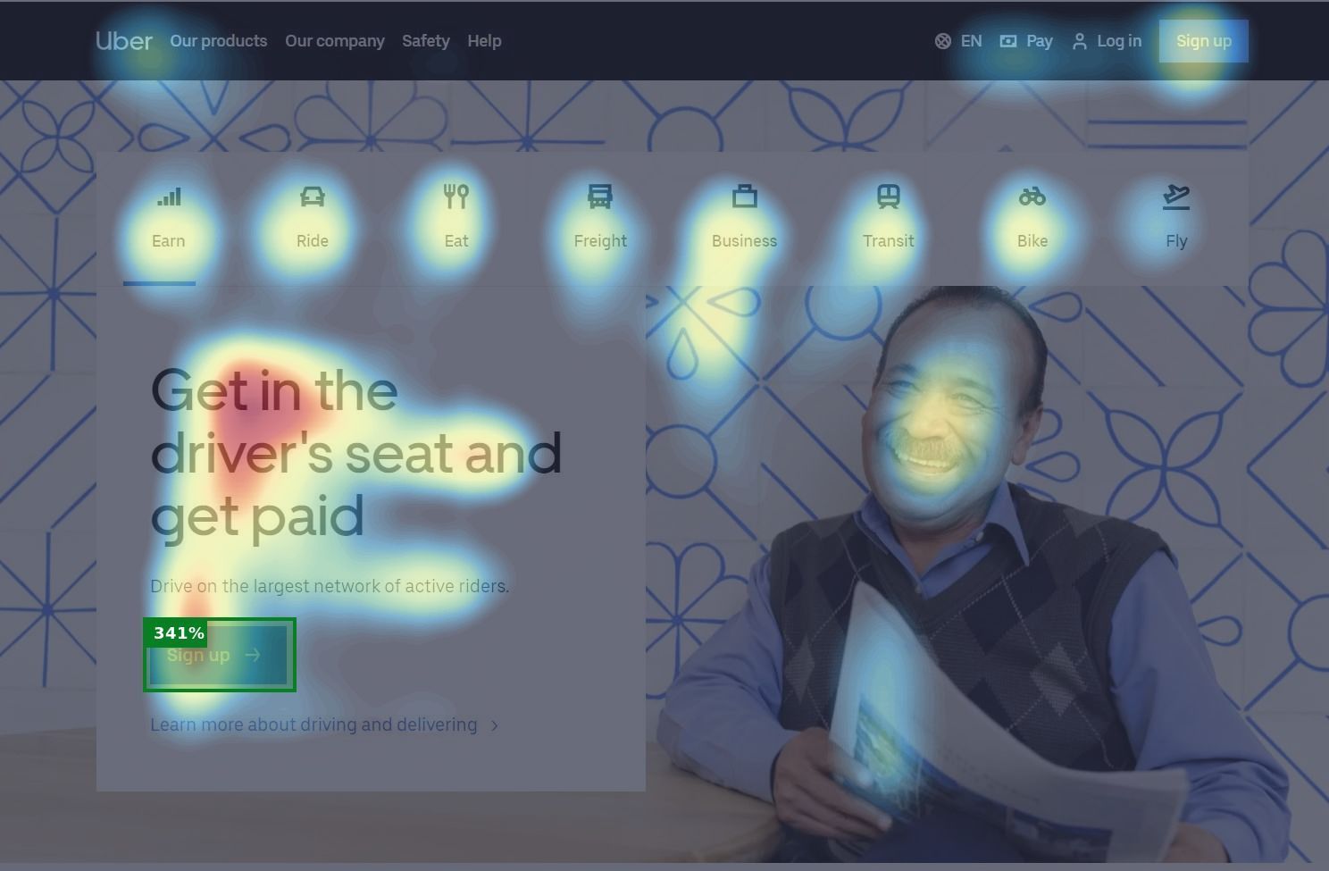
By applying a basic design principle about faces, the new Uber landing page manages to guide the visitor’s line of sight straight into their Call to Action section. People are curious by nature and if other people look at something, they want to know what it is they are looking at. Thus, by re-arranging the sight of the model to the Call to Action section, they accomplish to focus the visual hierarchy there.
For the sake of this analysis, we defined two AOIs around the basic call to action elements in both screens. The results indicate that the Call to Action button on the new landing page is almost x2 more visible than the equivalent old button.
AOI Results
| Landing page variant | AOI | Meaning |
| Old | 186% | 2.86 times above the average attention |
| New | 341% | 4.41 times above the average attention |
Bonus
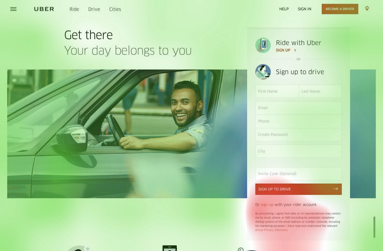
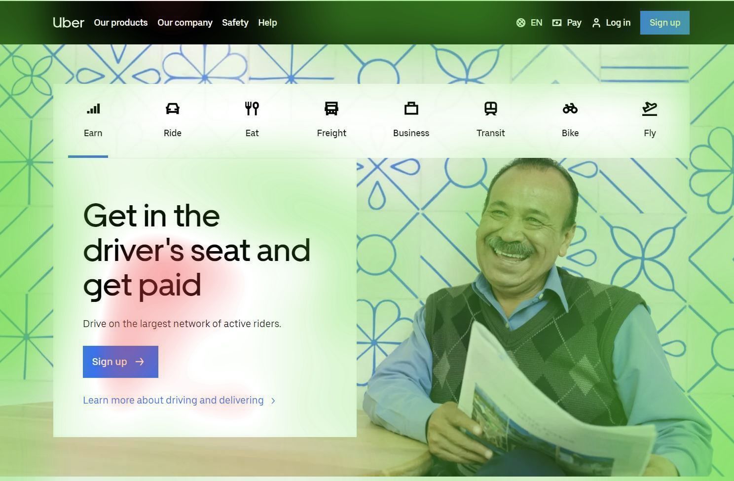
In this before-after example, the landing page’s Clarity Score increased from 68% to 77% which means that the screen communicates the desired information better and appears less cluttered.
👇 The VisualEyes’ example project 👇 (or open in a new tab)
