FANDOM is a global entertainment media brand powered by fan passion, co-founded by Jimmy Wales, the legendary Wikipedia co-founder. FANDOM has a global audience of over 200 million unique fans with more than 400.000 communities.
FANDOM’s primary source of income comes from advertising, as they can target fans across the globe. If you get paid for clicks, then you get paid higher for more clicks 🙀
Julia Jakubczak, an Ad designer at FANDOM, working closely with the Ad Engineering team, was passionate about performance and how to be the greatest at her job. Her tasks involved creating ad banners that would gather the attention of the forum’s users.
This was quite challenging, as users are dodging banners due to Banner blindness. Performance in FANDOM’s scale is essential, and Julia nailed it by utilizing AI technology capable of predicting future outcomes.
With VisualEyes’ insights FANDOM tested and picked display banners that achieved 20% higher CTRs. Let’s see how Julia did this.
FANDOM’s methodology for testing with VisualEyes
Advertising banners nowadays are acting as peacocks, trying to grab our attention. What Julia understood when she found VisualEyes was that testing before deploying her creatives to an ad network could increase CTRs for banners and the revenue streams of FANDOM.
Her first step was to study what users value most, attention-grabbing creatives or clean ones that would deliver the message?
The answer for Julia was that users in FANDOM’s forum love clean designs more than cluttered ones.
As soon as she found out that Clarity was the metric to go, she started iterating her designs to find the most appealing, and hopefully the highest performing.
She first drew the following banner, with a Clarity Score of 75. While an exciting design, information was not easy to read and obscured by the blurry background.

With continuous tweaks and after a handful of new designs, Julia managed to increase Clarity Score to 97 🎉
Now the design below speaks of its self. Being crisp, clear and straightforward, it delivers the message to users of FANDOM directly, and with precisely the same context.

The numbers
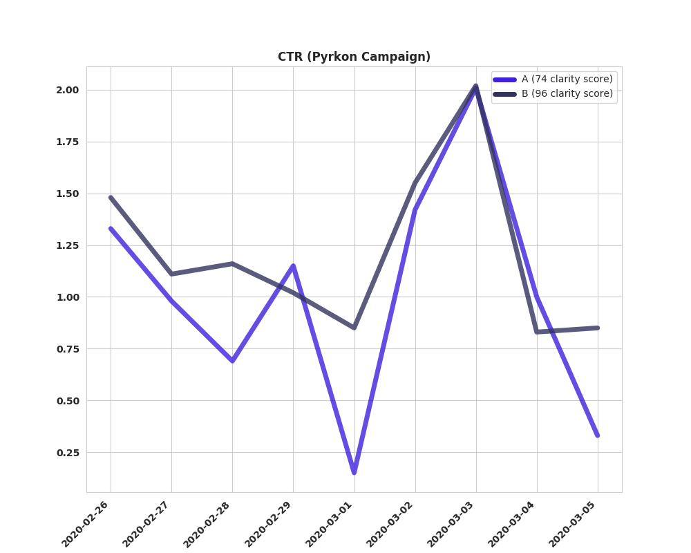
FANDOM’s ad engineering team A/B tested the above creatives to check if higher Clarity relates with higher CTRs.
After a few days, the results arrived.

An average of 20% higher CTR with a less cluttered banner! An increase to celebrate 🎉
In Short
- Small enhancements, Clarity Score-wise, might reflect on better click through rates.
- Aesthetically pleasing and clean design can be a credibility establisher in modern noisy advertising space.
- A/B testing on production needs at least two weeks of traffic, but we can be confident to release effective versions of our banners with predictive testing.
- Make your own experimentation process. Testing with historical data can let you define how to test your new designs.
