On a scale of 0-10, how well would you consider your eCommerce product page designs to be user-friendly while remaining true to business goals?
We know - this is no small task. Especially in eCommerce, most designers are responsible for everything (from designing or customizing a wireframe to coding it to go live), almost no room is available for dealing with the UX of the page.
It doesn’t need to be overwhelming. With a few well-placed tips and tactics, you can take most of the work out of designing a product page that looks good and effectively guide your visitors to find the information they need to decide to proceed with a purchase.
In this post, we share three simple yet powerful tactics you can use to improve usability and ultimately conversions. Let’s dive into this:
1. Reduce Clutter with Whitespace
Do you remember using any of the available search engines back in the ’90s? If yes, you’d remember how Google has taken over the world. For the rest, back in 98’ Yahoo was the go-to for finding information online. Their webpage was full of content with little whitespace. At the time, Google has just launched its beta webpage, disrupting the industry by introducing a lot of whitespace and focusing only on one action for the user.

Whitespace is considered an active element in design practices these days, used to create some breathing room around elements resulting in websites that look comfortable to read, navigate and use. There are two main distinctions of how whitespace is applied. These are macro vs. micro. Let’s break those down:
Macro: Macro is the space between the elements of text, images, CTA, etc. This is the most common distinction of whitespace. Macro is used for grouping the elements creating a sense of order that helps users scan the website.
Micro: Micro is the space between smaller elements such as letter spacing and line-height. Micro is used for improving readability for the user.

How to see if your website has clutter?
There are several ways to identify if your website is cluttered. The simple rule says that having too many elements in a product page or too much text, creates clutter and makes it hard to communicate with the users. To understand better how clutter works in a webpage, we have created an example below comparing 3 pages with different levels of clutter:
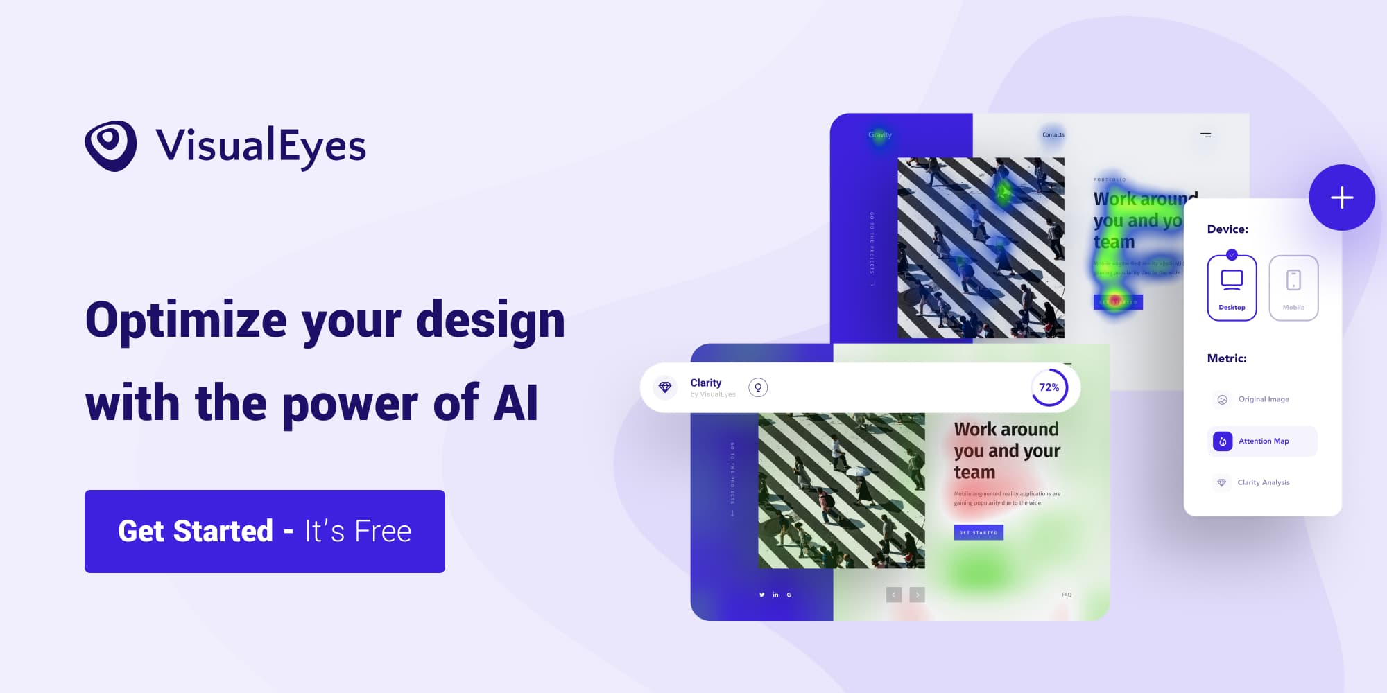
VisualEyes Clarity feature is a perfect substitute for a quick Preference Test as it allows designers to identify cluttered areas in a design. Looking at the Clarity map, see how the cluttered areas (highlighted with red color) change when whitespace is applied, resulting in improving the overall Clarity score of the page.
2. Understand How Visitors Scan Your Website
When visitors arrive on a page, they don’t put the effort to read every piece of information. Instead, they scan the website with the least possible effort to achieve their goal. When designing your product page layout, it is essential to know the way your visitors are most likely to view your page. This knowledge enables you to make design decisions to prioritize the placement of the most essential elements to be noticed by users quickly.
How users see your page?
NNGroup’s research did an eye-tracking study and found out that there are 4 main patterns that people use to scan textual information on webpages: F-pattern, spotted pattern, layer-cake pattern, and commitment pattern. How you present your content is likely to favor one of the four text-scanning patterns.
In eCommerce, the way you organize the product information elements inside the product page is the key to achieve a Visual Hierarchy that will lead users to take the desired action.
Here is an example of a product category page nutrition supplement company Ritual.

On a first look, everything seems perfect. Nice colors, pretty clean with clear headlines and descriptions.
Assuming that the most important elements on this page are a) the add-to-cart button that informs the user for price and is the next step to the sales funnel, b) the Product Description that informs the visitors if the product is right for them, c) the Product Image and d) the Product Name, we take a look on the heatmap in VisualEyes to see how the attention is distributed across the page.

Looking at the predictive Eye tracking maps, we can see that the Product Title gets more attention than the add-to-cart button. Since the add-to-cart is the most important element of the page, we would want to find ways to change this and give more attention to the add-to-cart button. A simple solution would be to reposition the elements and see how it affects the heatmap.
By taking a look at the AOI results, we see that in Layout 2 there is an attention increase by 115% on the add-to-cart button in comparison with Layout 1, while Layout 3 had the most ‘balanced’ results. This example makes it clear that the way you group and place the elements on a product page has a strong influence on the Visual Hierarchy of the page. Knowing the importance and how to place the elements on a product page is the key to improve the visual scan and increase conversions.
Want to check for yourself if your elements are visible? Sign-up in VisualEyes and run your first 5 predictions for free - no credit card required!
3. Choose Colors Aligned With Your Niche
Choosing color patterns based on your target market is a great way to boost psychological connection with your visitors and make them trust your online store and ultimately proceed with a purchase. Besides psychology, colors play a vital role in your conversions since they can highlight elements and creating a contrast that receives a lot of attention.
The most popular color choices for CTA buttons are red, green, yellow, and orange because they create a strong contrast with the background, getting the visitor’s attention. Attention is highly related to conversion especially in CTA buttons - Hubspot run a few A/B tests on buttons with different colors with the initial hypothesis that the green color will perform better. After the experiment, they found that the red color outperformed green by 21%, considering that it is a more ‘attention seeking’ color.
Although picking the right CTA button color is undeniably vital for your conversion rate, there is no rule saying that one color is better than another. Some colors are used with CTAs more often than others, but that doesn’t mean you must limit your options with those specific choices.
Using VisualEyes, you can see what works best in terms of attention and clarity by applying different colors to your designs and instantly see what performs best. For example, the UK-based drinks company Peak has a created a product page using an amusing three-color scheme that resonates well with their audience.

They chose black as a color for their add-to-cart button that creates consistency with the brand guidelines, but how well this translates to attention?
To answer this, we created two alternative versions using different colors for the add-to-cart button. To stay as consistent as possible and not negatively affect the aesthetics of the page, we chose the green and red colors from the showed products and compared the results in VisualEyes.
By looking at the AOI results, we can see that the red button gives an improvement of 43.1%, while the green button gives improves the attention by 31.3% comparing to the original black button. Another interesting finding was that Clarity Score - which calculates how clear and aesthetically pleasing a design is-, wasn’t negatively affected by this change. It improved by a small 1% in both cases!
Bonus tip: Research your competitors
At VisualEyes, one of the questions we hear the most is ‘Are my results good?’ In eCommerce, several other online stores certainly compete with your offerings. By doing a little research on the competition you can quickly get insights about clarity and attention that will allow you to use as a benchmark on your results. To see how well your website stands in terms of competition, you can read our article ‘How to benchmark my website against competitors?’
Resources:
https://www.apptension.com/blog-posts/how-to-use-white-space-in-web-design
nngroup.com/articles/ecommerce-product-pages/
https://blog.hubspot.com/blog/tabid/6307/bid/20566/the-button-color-a-b-test-red-beats-green.aspx
http://www.joehallock.com/edu/COM498/preferences.html
https://www.nngroup.com/articles/zigzag-page-layout/